Hello everyone:
Please remember to scroll past the end of the essay to read this week’s curated Anthropocene news.
Now on to this week’s essay:
I’m well aware that the scale of my project here – articulating for you the range and depth of human impact in the Anthropocene – is ridiculously large. In that sense, it’s an irrational task, but one befitting an irrational civilization entering a dangerous era. It’s an era that needs optimistic pessimists.
I’m aware also that each week I risk adding to the overwhelming sense many of you have that the world has gone wrong in so many ways, and with such interactive complexity, that little can be effectively done to cure it. And I have to be careful to describe our complicity in this wrongness within the context of our entrapment – there is no space or place outside the Anthropocene – while pointing to paths forward and the people who are blazing them.
What we need, really, is a map. We need a map that guides us through the Anthropocene in a way that we can at least wrap our minds around it, even if it often overwhelms us. We need a map that illustrates the core problems in our current relationship to the Earth, the problems which are creating existential crises for life on the planet, including our own. In a crisis it’s better to have a map, however incomplete, than wandering ahead without a plan.
A quick caveat on maps, though: As I said in my second essay for this Field Guide, it’s not a coincidence that a species which can map the Earth has also endangered it. We live in a global culture which prioritizes the reimagining of the world for our own purposes, so that forests disappear, mountains are ground into coal dust, and ocean canyons glitter with plastic confetti. Yet we still need an Anthropocene map, because the monsters we have imagined into being will have to be imagined back into livable companions.
For an Anthropocene plan concerned with biodiversity and other planetary health measures but focused largely on climate, there is nothing better than Regeneration, from Paul Hawken and his colleagues. I highly recommend you buy the book and peruse the site.
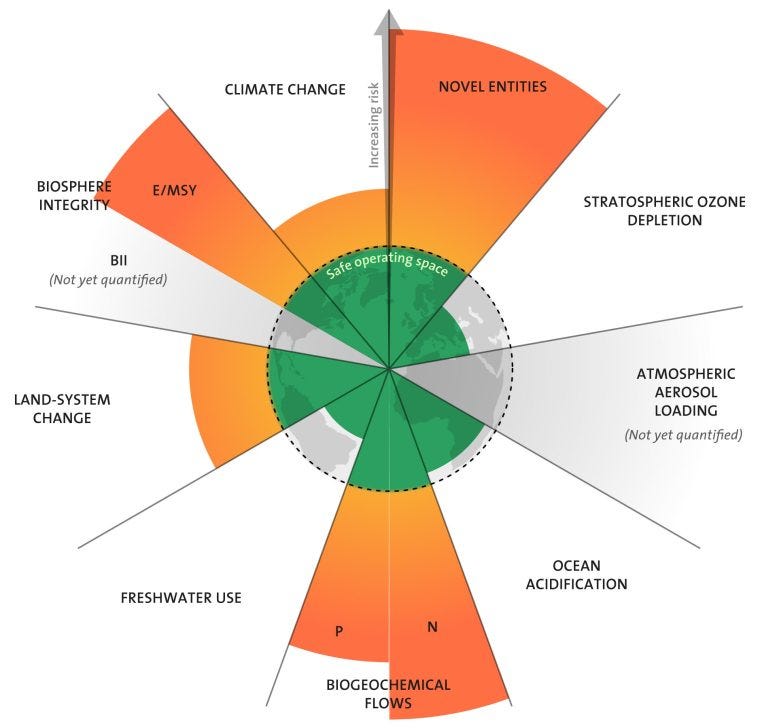
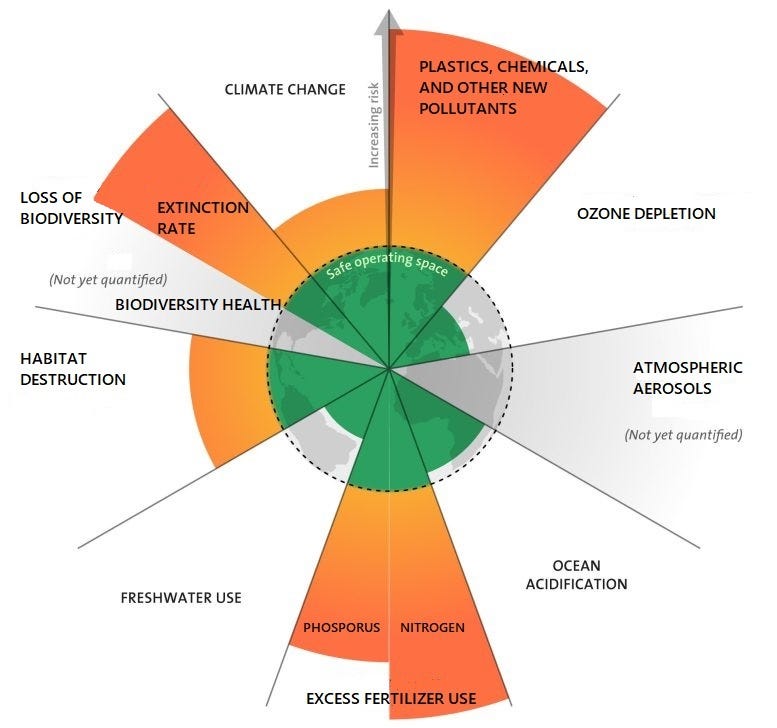
But for a single image that acts like a map to guide us forward, the best one I know is the one I introduced you to a few weeks ago, and which introduces this essay: the Planetary Boundaries graphic from the Stockholm Resiliency Centre (SRC). It is the result of years of labor, still ongoing, by a scientific team led by Johan Rockström – who I’ll talk about in a bit – which has qualified the fundamental workings of the planet and quantified to what extent we have disrupted those processes and thus interrupted, catastrophically, the balance of life that has fostered our own remarkable growth.
Here’s what I wrote about it a few weeks back in my Breaking Boundaries essay:
This is a map of those broken boundaries. The Stockholm Resiliency Centre (SRC), “an international research centre on resilience and sustainability science” and a joint initiative between Stockholm University and the Royal Swedish Academy of Sciences, composed a list of the nine planetary processes that “regulate the stability and resilience of the Earth system” and devised the graphic to represent the data on how each of these boundaries is faring. The green inner circle is the “safe operating space,” while the yellow represents the zone of increasing risk and the orange warns us that we’re well beyond the zone of uncertain risk and into real trouble. As an image, perhaps its key message is that we must discard the harmful fiction that the resources civilization relies on are limitless. In fact, it says, we’ve blown past some of the limits already.
Pushing these boundaries too far, particularly climate and biodiversity, will push the Earth system into what Rockström refers to euphemistically as a “new state.” That is, the planet won’t be familiar anymore. It won’t resemble, in fundamental ways, the stable “Goldilocks state” the Earth has been in for the last few million years. Heating the atmosphere beyond 2°C, erasing continental-scale swathes of habitat, and setting the stage for a sixth mass extinction isn’t just rolling the dice, it’s betting the farm and the planet it sits on.
Thus, this is a map not really of where we need to go, but where we need to come back from. We need to retreat from the hazards of the unmapped red zone that we might as well label with Here be Dragons… because our Anthropocene push into those zones is what breeds the dragons.
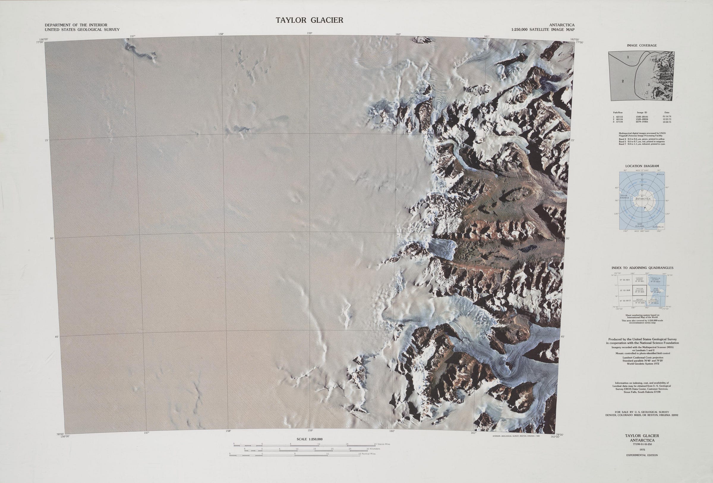
As an aside, I’m reminded of old USGS maps charting where the stony edges of Antarctica meet the vast ice cap that covers nearly all the continent. As mountain ranges or coastline are submerged beneath the undifferentiated surface of the ice cap the mapmakers sometimes kept the paper blank with a note about that area being beyond the “limit of observation.”
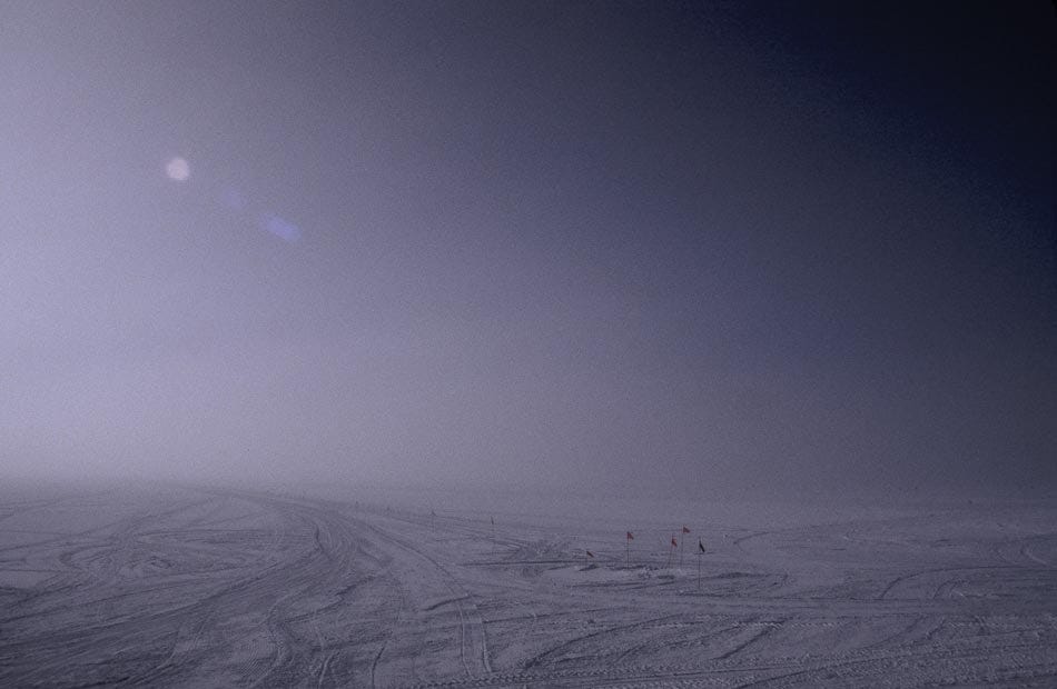
Indeed. How do we map the ever-changing surface of a sea or the wind-blown snow atop an Australia-sized expanse of mile-deep ice? We can map the floor beneath sea and ice and sample what lies between it and the surface, but at the surface there is only the incessant flow of energy, whether wind or wave. It’s a fog of data.
The Planetary Boundaries graphic should be far better known. It should be taught in school (within increasing complexity through higher grades) and discussed regularly in the media. It should be a tool used to illustrate environmental campaign pledges for national office. (I’m dreaming now, I know.) It’s a brilliant imagining of how the basic systems of the planet are responding to our lack of civilizational restraint. More importantly than that, though, it’s a map of the dangers to civilization itself, which makes it relevant to everyone who can read the map.
And therein lies the problem. The SRC’s work is brilliant but they can’t seem to decide if this graphic is for all of us or just for researchers and activists deeply involved in the technical discussion. It’s an elegant image, with a green Earth-like circle at the center representing the safe operating space for the planet’s chemical, biological, and physical systems that have nurtured humans throughout our history. Beyond that lie the ever-widening, brightly-colored zones of risk and outright hazard that we have to understand and respond to. It’s a set of big fat stoplights for the Anthropocene.
And yet the map is not nearly elegant enough. The graphic desperately needs good, clear labels which make sense to any literate observer. A stoplight isn’t useful if it requires a cop at the street corner explaining it to each passing driver. For example, the fate of Earth’s plants and animals (Biosphere Integrity) is split into two inscrutable metrics, E/SMY and BII. It took a good bit of searching online for me to get these named and defined: “extinctions per million species years,” and “biodiversity intactness index,” neither of which makes much sense at first. For the casual observer, they could be called something like “extinction rate” and “biodiversity health,” while the more complex language is kept behind the curtain.
Nor is it clear where predicted tipping points are for each assessed category, i.e. why yellow caution turns to orange alarm. This may be largely because that kind of specific calculation is extraordinarily difficult. When, for example, did we cross the line from transforming too many ecosystems (Land-System Change) to transforming so many that we risk losing many of the species that rely upon them? But where these tipping points are quantifiable – levels of CO2, say, or amount of freshwater use – they should be noted. The more accurate the map, the more usable it becomes.
Also, Johan Rockström has made it clear in his talks that Climate Change and Biosphere Integrity are “core boundaries,” i.e. categories whose impacts are more fundamental to a livable planet than the others. They impact, and are impacted by, the status of the other boundaries in especially important ways. It would be useful if the graphic somehow reflected this basic principle.
I spent quite a bit of time digging around online for the really clear, simple, updated explanation of the graphic I was sure must be out there. Instead, what I found was a real hodgepodge. Even the Stockholm Resiliency Centre’s own site was a bit foggy and out of date. One source I really wanted to like is Welcome to the Anthropocene (created by a consortium that includes the SRC), which calls itself “the world's first educational web portal on the Anthropocene.” There’s a lot to learn here, and I recommend you poke around the site, but the design often prioritizes imagery over real science communication.
There are two good resources that I want to share for your further exploration: a 2020 TED talk by Johan Rockström with a bracing title (“10 years to transform the future of humanity -- or destabilize the planet”) and Breaking Boundaries: The Science of Our Planet, a Netflix documentary focused on Rockström and narrated by David Attenborough. In both cases, Rockström is an effective, engaging, and quietly powerful speaker.
Let’s start with the TED talk. It’s from October of 2020, and was designed in part as a 10-year follow-up to a previous TED lecture on the planetary boundaries concept: “Since my talk,” Rockström says, “we have increasing evidence that we are rapidly moving away from the safe operating space for humanity on Earth.”
Which reminds me that I should perhaps warn you that this excellent, clear-headed, optimistic, brisk and concise video explainer will likely trigger any anxiety you have about the impossibility of our Anthropocene task. Rockström is as lucid a guide to the Anthropocene as we could hope for, but his evidence for our problems seems to outweigh the prescription for the solutions. Yet, as Rockström makes clear, we must go on. First, he says, we should understand the glory of the Earth’s safe operating space:
Let’s stop for a moment and look at where we are. The foundation of our civilization is a stable climate and a rich diversity of life. Everything, I mean everything, is based on this. Civilization has thrived in a Goldilocks zone – not too hot, not too cold. This is what we have had for 10,000 years since we left the last ice age.
I think the Goldilocks analogy is borrowed from astrobiology and the quest for habitable planets at an Earth-like distance from their star, but the source story – Goldilocks and the Three Bears – has an appropriately tenuous ending:
So naughty, frightened little Goldilocks jumped [out the window]; and whether she broke her neck in the fall, or ran into the wood and was lost there, or found her way out of the wood and got whipped for being a bad girl and playing truant, no one can say. But the Three Bears never saw anything more of her.
21st century bears should be so lucky. Our transgressing of the planetary processes which regulate life has meant eating all the porridge and trashing all the beds. And it’s not just that we’ve addled the climate, spread plastic like glitter across every corner of the planet, acidified the oceans, and replaced entire ecosystems with an industrial supply chain; it’s that each of these actions, plus all the others, interact synergistically with each other: “The main point,” according to Rockström, “is that once you transgress one, the risks start multiplying. The planetary boundaries are all deeply connected.”
The good news, then, is that there will also be some synergistic healing once we start dialing back our transgressions. For example, less emitted CO2 means reduced ocean acidification and less pressure on species unable to adapt to a warmer world. Better yet, Rockström makes a good case that a knowledge of planetary boundaries and a dedication to the idea of a global commons – the Earth as a protected resource for all – adds up to exactly what we need: planetary stewardship.
The Breaking Boundaries documentary on Netflix makes a larger, more sophisticated version of this argument. Like the TED talk, the doc is cleverly illustrated. It’s not just the usual beautiful imagery of nature we associate with David Attenborough and the groundbreaking BBC Planet Earth crew; the doc frequently uses an animation of the planetary boundaries graphic, most notably with a recurring scene of a too-large population of android-ish humans walking outward from the safe zone across the yellow and orange zones toward an uncertain fate. The background is black space, and the colored surface they (we) walk on becomes brittle glass that cannot support us.
"Thanks to Johan and his colleagues,” Attenborough says in his characteristic somberly optimistic tone, “we now know the world has nine boundaries and the risks we face by crossing them." And this is an important point: from a particular how-the-Earth-functions perspective, this map is complete. Our world and its brittle edges lie within the graphic’s nine boundaries, as does our civilizational to-do list. And I’ll say this again: the to-do list is constructed not to keep bears from extinction, per se, but to keep Goldilocks alive. That’s us.
Of course the map and its to-do list are not all we need to be attending to in our response to the Anthropocene. At the risk of overwhelming you… here’s a partial list of the Herculean tasks this map does not include: reducing population, stabilizing and supporting democracies around an increasingly autocratic world; creating equity and justice for everyone; reframing civilization’s idea of an economy; and restraining our relationship with material goods.
All of these other tasks, like dragons hiding in the fog of data, lie beyond the limit of observation for the Planetary Boundaries map. But the good news – yes, there’s good news – is that these tasks are not in addition to dialing back our biological, chemical, and geophysical activity from the high-risk zones, they are the means we use to achieve that risk reduction. Societies with more equity and justice, and with reduced population and materialism, will be well on the path to cleaner skies, seas, and energy.
As we all know, it’s best not to look at a full to-do list when a task seems impossible. When rebuilding a home after a flood or fire, or rebuilding a life after the loss of a loved one, we don’t think about doing everything all at once. We can’t. We pick our battles and narrow our scope and move forward a step at a time. Eventually, the list gets smaller and the path gets clearer. That’s how we have to approach the Anthropocene.
Next week I’ll offer the concise and effective resource for the nine boundaries I couldn’t find elsewhere. In the meantime, I’ve taken the liberty of tweaking the language of the planetary boundaries graphic. It’s not the complete restructure I’d like to do, but maybe it’s a bit more readable.
Thanks for sticking with me.
In curated Anthropocene news:
Since we’re focused on graphics this week, check out this page of population-related graphics from The Overpopulation Project.
Watch this trailer for 8 Billion Angels, a 2021 documentary on the need to rein in and reverse overpopulation.
Finally, there are U.N. talks underway about setting limits on plastic pollution around the world, and the U.S. is on board with it.
From Inside Climate News: It’s becoming increasingly clear that we should be focusing at least as much on methane as on CO2.
Yes, the climate is more turbulent, but a good article at Yale e360 argues that weather-related disasters in human communities are also happening because of poor policy and poor planning.
“Meet the People Getting Paid to Kill the Planet,” a video opinion piece from the Times titled about industrial agriculture.

